この度、弊社の企業ロゴが完成しました!
企業ロゴについて会社設立前から構成を練っており、私たちの色々な想いを聞き入れてくれた 大切なシンボルになります。ロゴの意味について説明したいと思います!
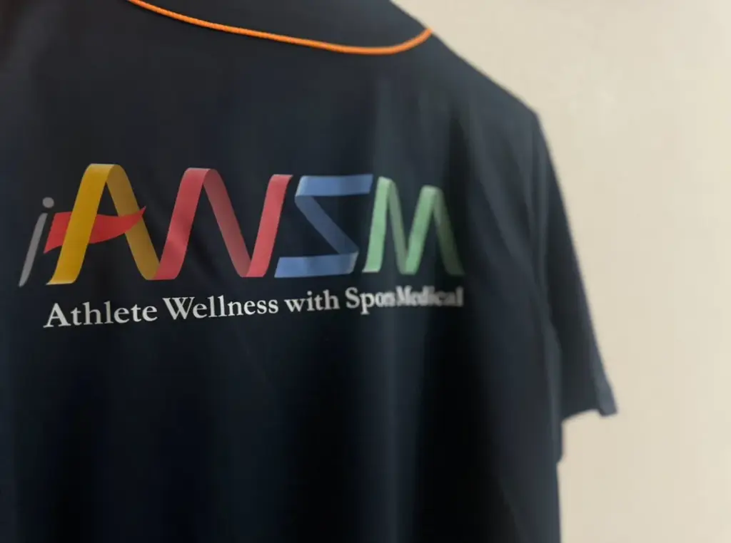
①テープやリボン的要素
「AWSM」の全体的なイメージはテープやリボンがテーマ。メディカル要素では包帯やテーピングに加え、包み込むイメージを持つCare的要素。 スポーツ要素ではゴールテープやメダルで使用するリボンなど、スポーツとメディカルをイメージさせる形にしています。
②インターナショナル、ダイバーシティ、多様性
カラフル色にしたのは、老若男女問わず、 そして国境を超えてメディカルサポートをしていく と言う意味を持っています。またメディカル的要素も組み込み温かみのある色にしました。
③リーダーシップ
先陣を切る 旗はスポーツ要素では優勝旗や団旗などをイメージし メディカル要素では私たちは救護のディレクターも行い メディカルチームとしてリーダーシップを図り先陣を切ると言う想いを込めて旗をトレンドマークとしています。
私たちのたくさんの想いがこもったロゴです!!
そして、このロゴが刺繍された、チームユニフォームも完成しました!早速、チームで着用して救護活動を行いました。
このロゴの想いを旨に日々頑張っていきます。
We’re excited to announce that AWSM’s official logo is now complete!
This logo has been crafted from before the creating company, and it truly represents all the ideas and feelings that are important to us. We’d like to explain what has meaning this logo.
1.Tape and Ribbon Elements
The overall design of “AWSM” features a theme of tape or ribbon. From a medical perspective, it evokes the idea of bandages and taping, with the sense of care that comes from wrapping and supporting. From a sports angle, it reminds us of finishing tape at the end of races and ribbons for medals, blending the concepts of sports and medicine seamlessly.
2.International, Diversity, and Inclusion We chose a colorful palette to represent support for people of all ages and backgrounds across borders.These warm tones also reflect the care and compassion at the heart of our medical services.
3.Leadership and Taking the Lead
The flag element symbolizes leadership in both sports and medical fields. It reminds us of championship flags and banners, and reflects our role as medical directors, leading the way and guiding teams with expertise.
This logo embodies everything we stand for, and we’ll continue striving to live up to these values in all we do.